


By, Adam Kankiewicz July 24, 2015
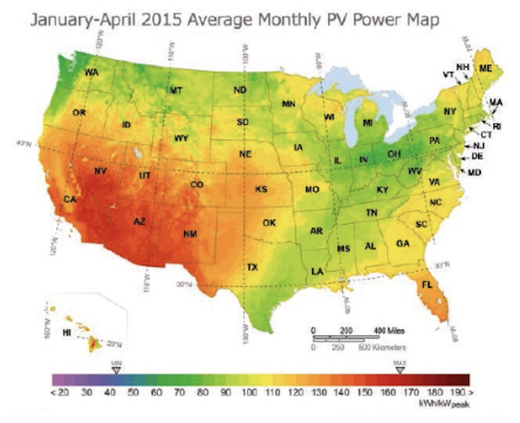
PV Power Maps report national solar resource availability based on the monthly energy output of a nominal 1-kilowatt (kW) photovoltaic (PV) system by location. In this issue, both maps show monthly average values for the period January through April 2015. With the volatile weather experienced in many parts of the United States during this time period, it’s not surprising that several regions experienced noteworthy above and below swings in PV energy production.
The PV Power Variance map compares the percent difference between actual average monthly PV production to the typical longterm energy production during the January through April time period. As the maps show, extended southwestern United States drought conditions led to above-average PV energy production across most of the West. Enhanced PV production was also observed across the upper Midwest and northern New England region. In contrast, below-average PV energy conditions dominated the southern plains, southeastern United States and Mid-Atlantic regions due to wetter and cloudier-than-average conditions.

The average monthly PV Power Map can be used by anyone to quickly gauge the generation potential of a new PV system, or benchmark the performance of an installed system, in a given location. Simply multiply the power output indicated on the map by a project’s capacity, in kilowatts, to calculate the estimated average monthly power output during the January through April 2015 time period.
For example, a 4-kW PV system in San Francisco, California, would have produced, on average, approximately 520 kilowatt-hours (kWh) per month in January through April (130 kWh x 4 kW = 520 kWh). This is approximately 12% more than the longterm monthly average from the same time period. In Harrisburg, Pennsylvania, a 4-kW system would have produced approximately 380 kWh per month (95 kWh x 4 kW = 380 kWh), which was approximately 10% below the typical monthly production for this time of year.
To gain an understanding of the production of a particular system over a period of time, you can view historical PV Power Maps from 2012, 2013, and 2014 at solartoday.org/pvpowermap.
The PV Power Map is created with power output estimates generated by SolarAnywhere services from Clean Power Research; these include simulation capabilities and hourly satellite-derived irradiance data with spatial resolutions from 1 to 10 kilometers. The calculations are based on a PV system with a total 1-kW nameplate rating that is configured as five 200-watt PV panels with a 1.5-kW inverter; fixed, south-facing panels with 30 degree tilt; no shading; panel PVUSA Test Conditions rating of 178 watts; and inverter efficiency of 95.5 percent. Access free historical irradiance data at solaranywhere.com.
Adam Kankiewicz (askcpr@cleanpower.com) is a research scientist at Clean Power Research, cleanpower.com.